Introduction to Bootstrap
This course is about Bootstrap, a popular web UI/UX framework for building responsive, mobile-first webpages. Bootstrap was originally created by Twitter, and is now open source for the entire web development community to use.
Why Bootstrap?
Have you ever opened a web page on your phone and had to zoom in, just to read the text?
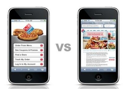
Bootstrap solves this problem by providing CSS classes and Javascript that help us create web pages that will re-size automatically to the screen size of the browser using the webpage.
This is what is known as responsive web design.
Websites used to be created for desktop computers, but now that most people access the web though a mobile device now (such as an iPhone, or iPad), webpages are expected to re-size to still be useful for someone with a 4" phone screen, as well as someone with a 15" monitor.
Pre-requisites
This chapter assumes a basic understanding of how HTML, CSS, and Javascript are loaded to a web page.
Topics
Here are the topics we will cover in this course:
- Introduction to Bootstrap - The current page
- Getting Started - How we can add Bootstrap to our web page
- Bootstrap Containers - The base buidling block of Bootstrap pages
- Intro to grids - Using the grid to create responsive containers
- Typography - Headings, paragraphs, code, and quotes
- Buttons - Bootstrap standard buttons
- Forms - Bootstrap standard forms
- Modals - Pop up modals